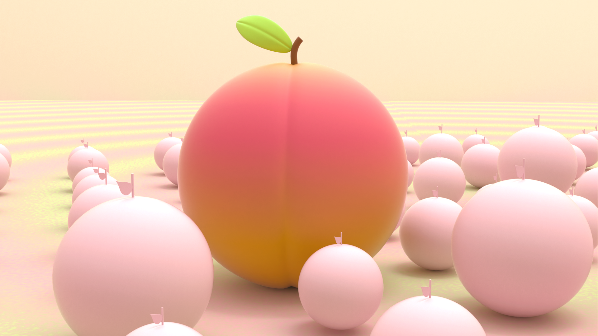
Styleframe and Animation
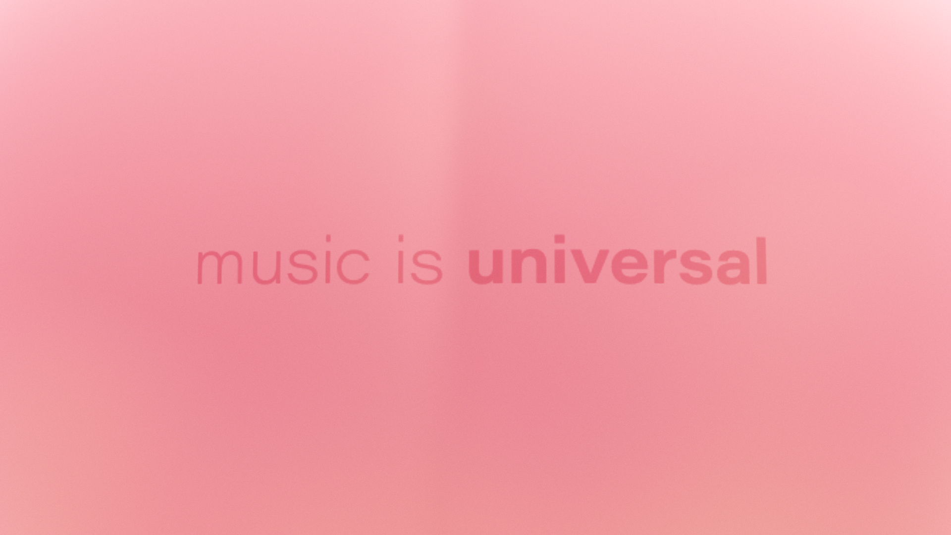
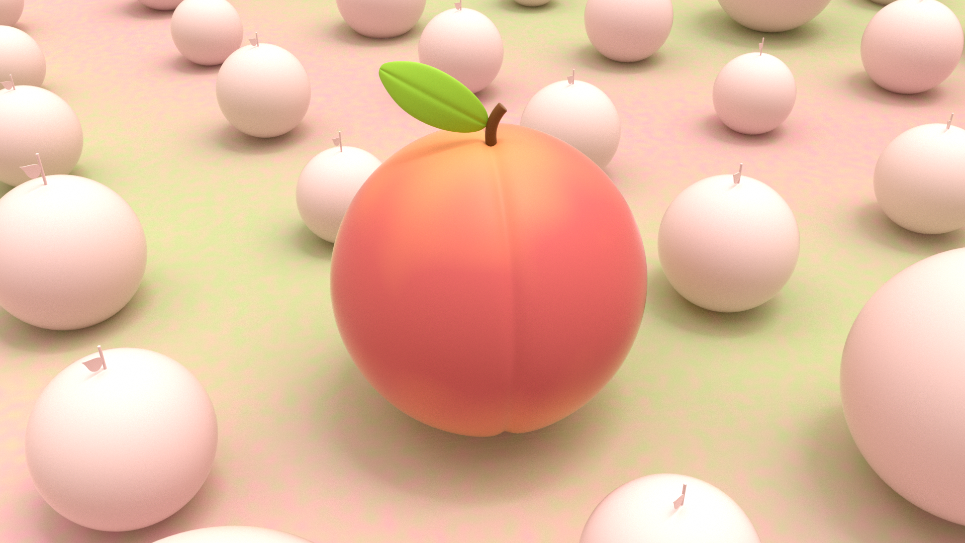
Here is my process work for the Universal Music Project titled “Fruitventure”. I’ve been through a lot of different versions of look dev, concept and colors.
First Pass
Style Frame


Animation
Notes
The color palette is very pastel, but it is still not fun enough. Overall it needs to be more saturated to bring the exciting energy. Also, the story itself is not as strong as before because the bowl is now replaced by a tiny pin. The best solution for this is to bring back the colors from the original style frames and combine them with the new ones. Also, replace the pin with the wide bowl that was in the initial frame.
Second Pass
Style Frame


Animation
I revised the color palette to be more saturated and brought the bowl back to make the story stronger…but the concept is a little bit confusing with the unintentional movements of the fruits…
Notes
The story and the mood were not clear and fun enough and the peach animation needed to be faster, more aggressive, and consistent. In order to execute this, I have to think about how people react when they try to get in front of the line and then add those to the project.
Third Pass
Style Frame


Animation
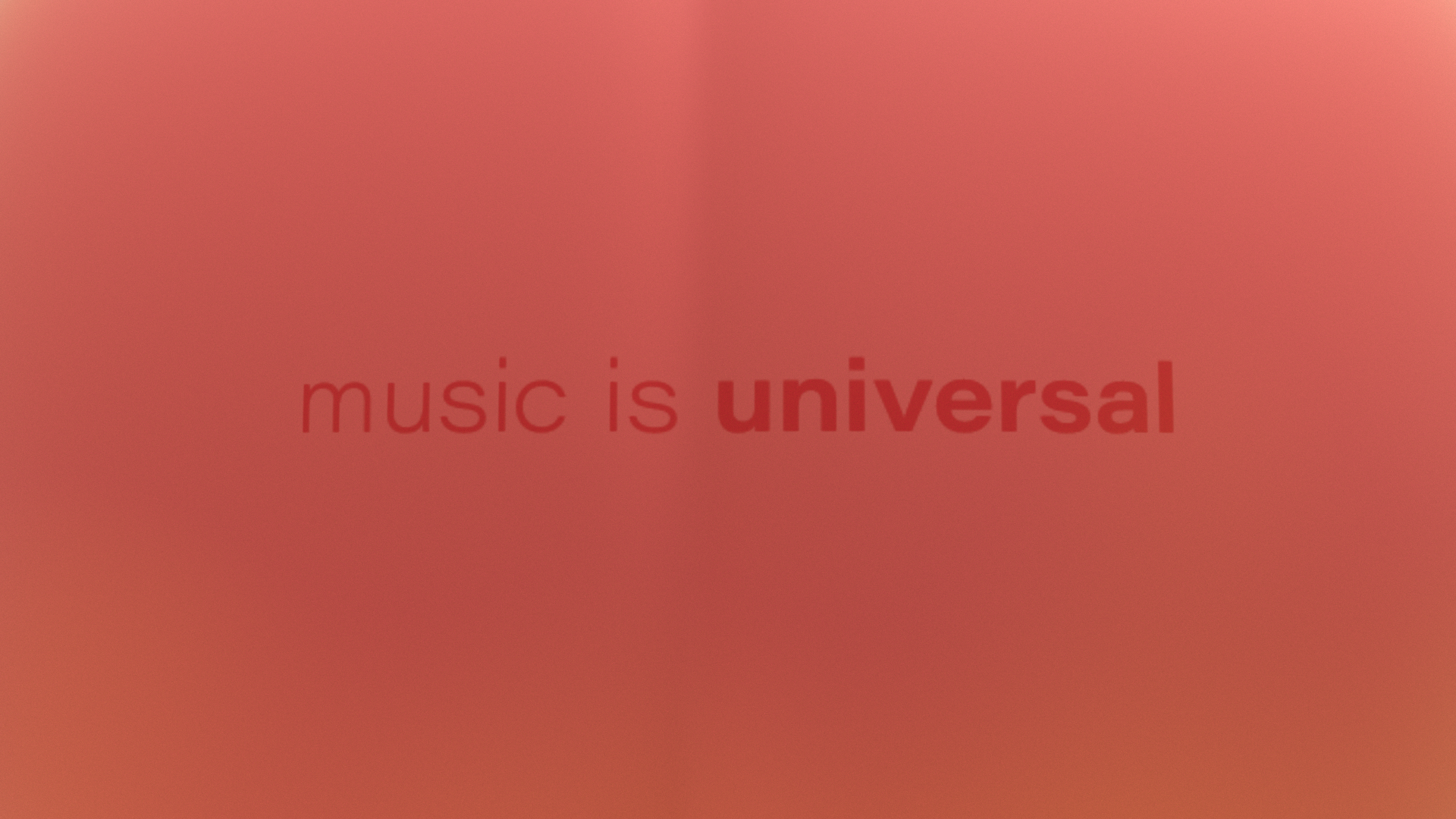
Version 01: without graphic elements
Version 02: add graphic elements to compare which one will look better
Notes
I received feedback indicating that the project appeared more appealing in its initial version (version 01). Additionally, the graphic effect used in the second version seemed to flatten the animation. Furthermore, towards the conclusion of the animation, when the peach falls into the bowl, the confetti will be triggered, starting from the bowl, flying up, and then fall down along with the smiley face sticky note.
Move the track name toward the end: track 08: Cairo Mystery only on Universal Music
Final Pass
Style Frame

