Styleframe and Animation

Here is my process work for Sesame Street. Alex Cho and I have tried a lot of different art mediums and been through many changes.
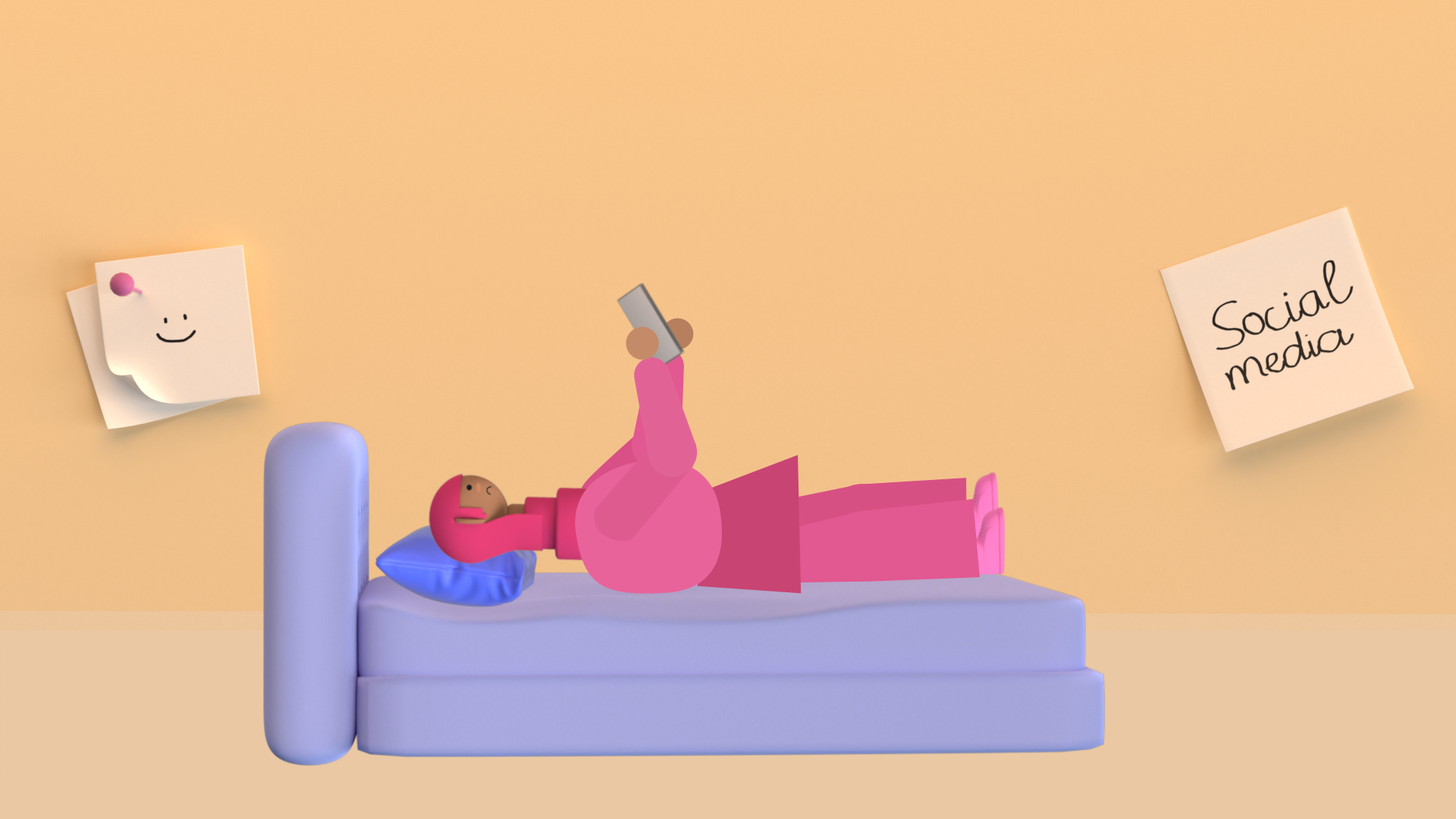
First Pass
What I’ve learned in this first pass is very valuable. Even though my style frames show good-looking design, it does not communicate the message or the story at all. I had to go back to the brief, and together with my art director sketched out the visuals that matched the voiceover.
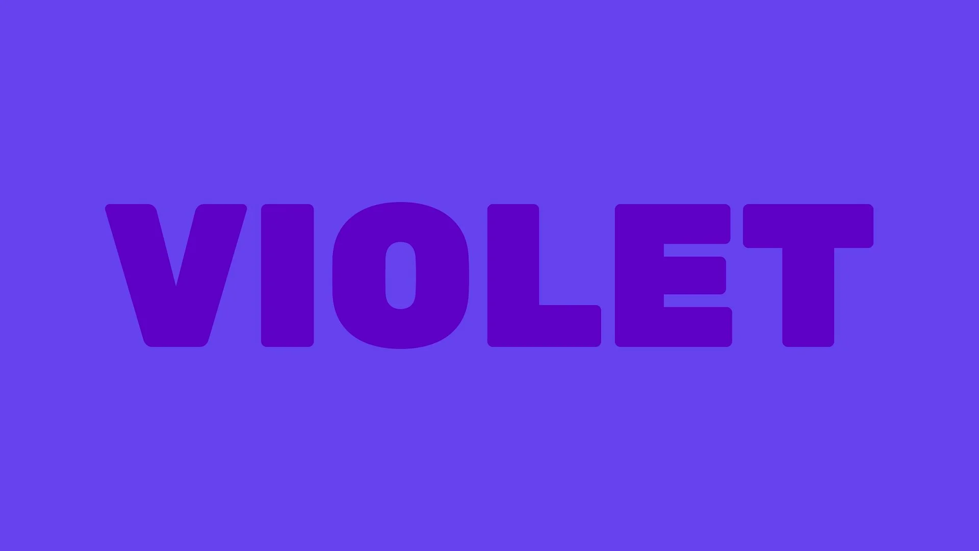
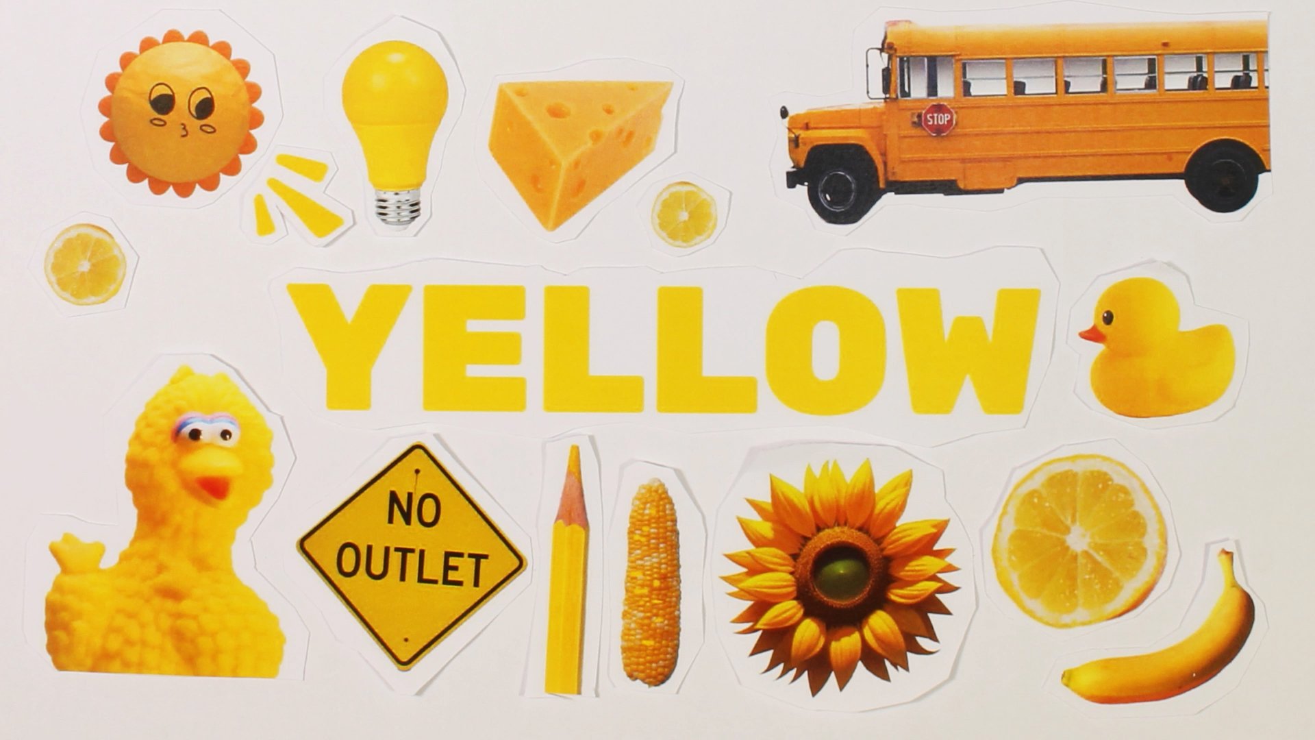
Style Frame


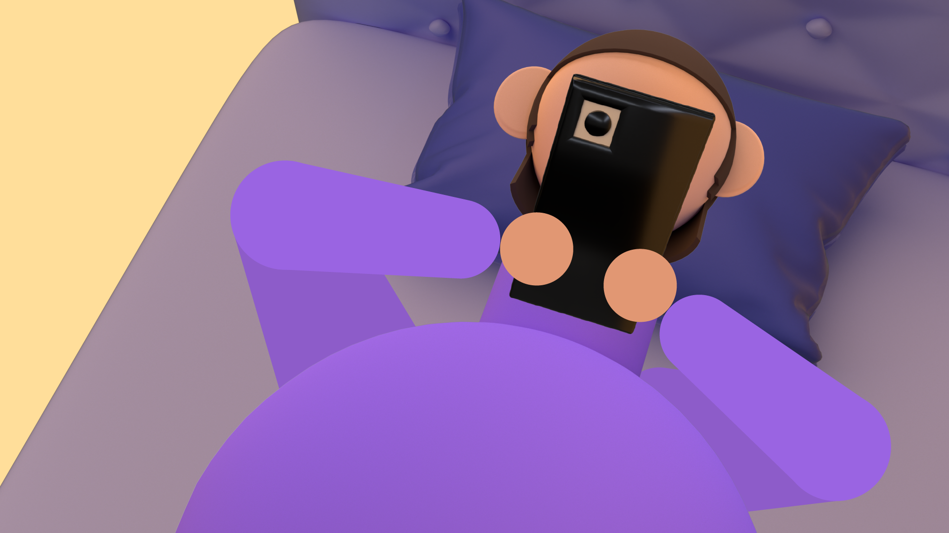
Animation
Notes
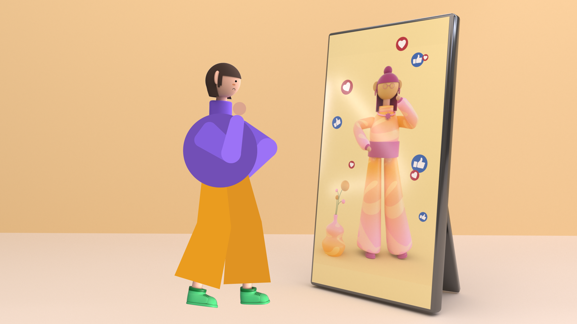
Overall it’s heading to the right direction, but the visuals are not clear to tell the story and match the images with the voice over. Text is also too small to read. The art director revised me to reconsider the size and think about how to deliver the narrative more effectively.
Second Pass
What I’ve learned in the second pass is the design and style of the project are very important…always need to find the right but unique approach to stand out from others
Style Frame


Notes
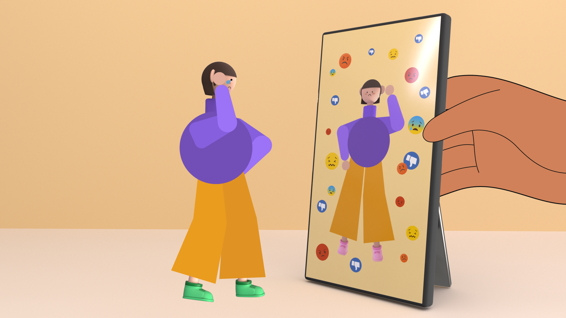
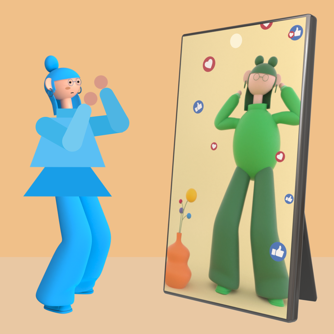
The narrative is getting there, but it lacks sufficient clarity. The chosen color scheme does not effectively communicate the intended story because it appears too subtle to convey a powerful message. Additionally, my art director has recommended that I enhance the stylistic elements to make it more engaging.
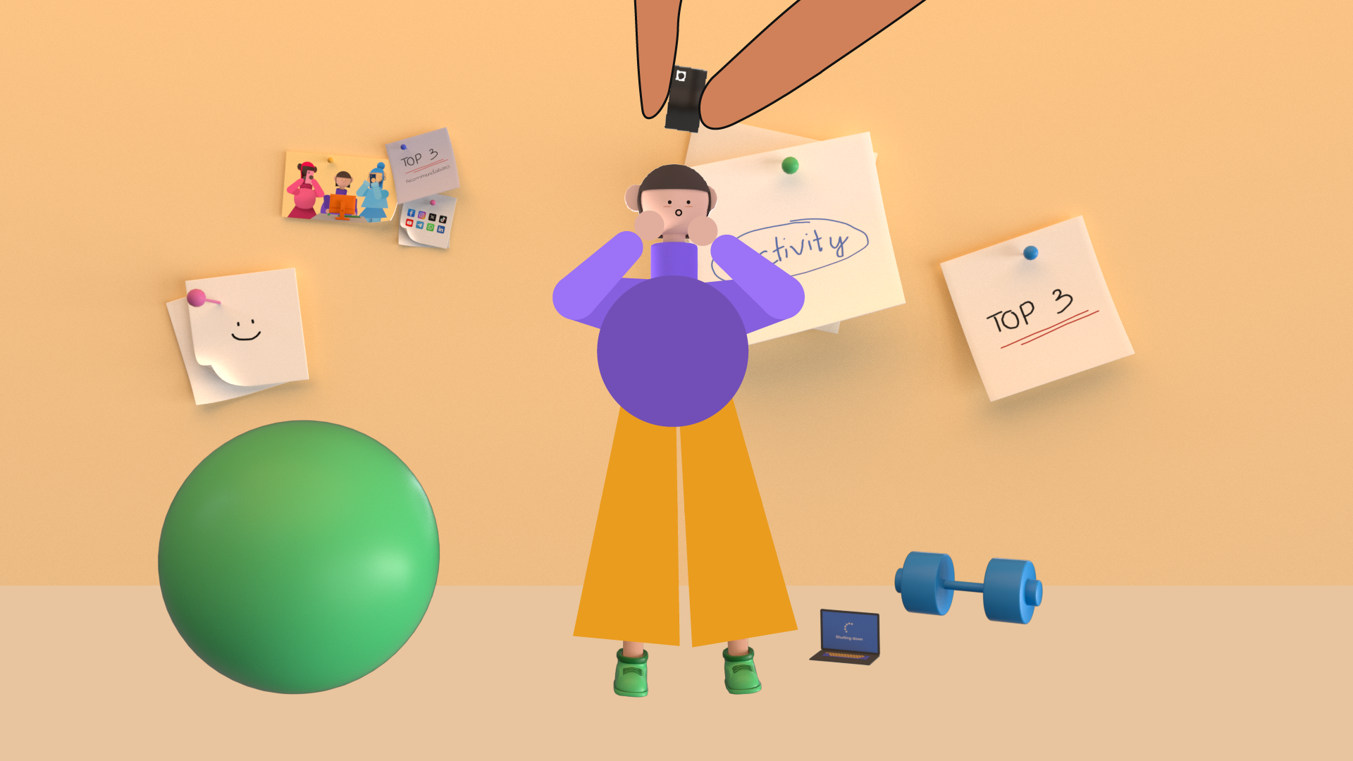
Animation
I revised the color palette, and combined 2D and 3D shapes to bring more design aesthetic to the explainer video..the timing seems a little too long and boring…
Third Pass
What I’ve learned in this third pass is that always design based on the brand color palette. Also, the important thing is to make the story SHORT and SWEET to keep full audience’s attention.
Style Frame


Notes
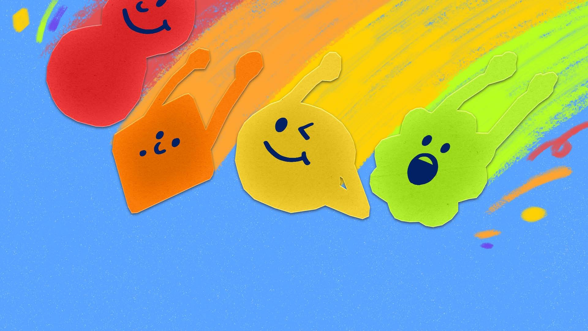
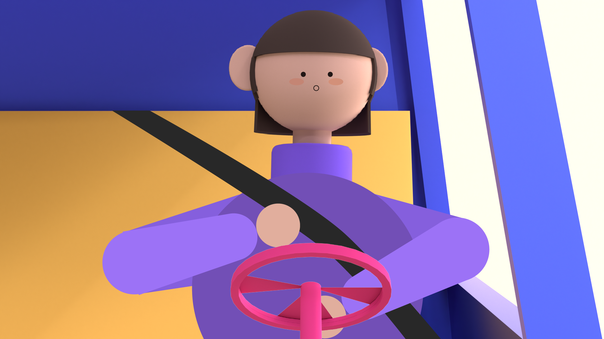
I received feedback indicating that the project appeared more interesting than the previous version. However, the current style does not say anything related to NBC style. My art director advised me to use Peacock colors from NBC logo for my main character design.
Animation
I revised the color palette, and combined 2D and 3D shapes to bring more design aesthetic to the explainer video..the timing seems a little too long and boring…
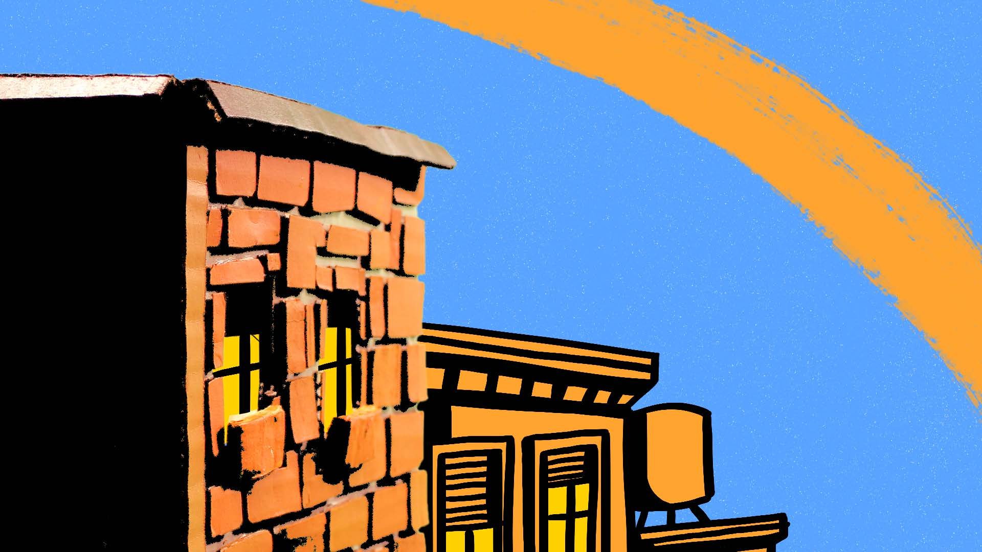
Fourth Pass
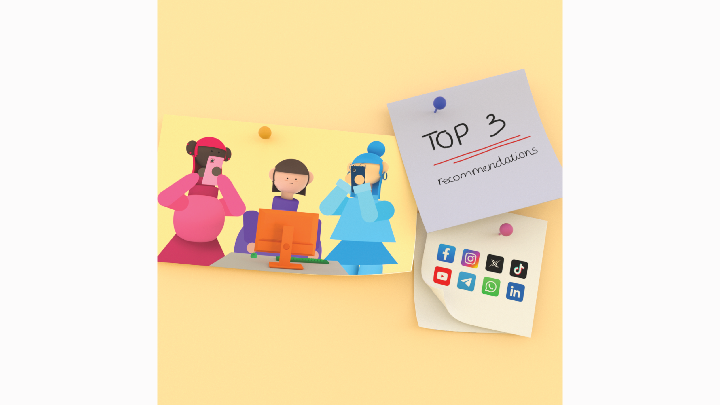
What I’ve learned in this pass is the animation needs to be impressive and energetic to tell the story and keep the audience’s attention. Also, making the design match with the voiceover is very important.
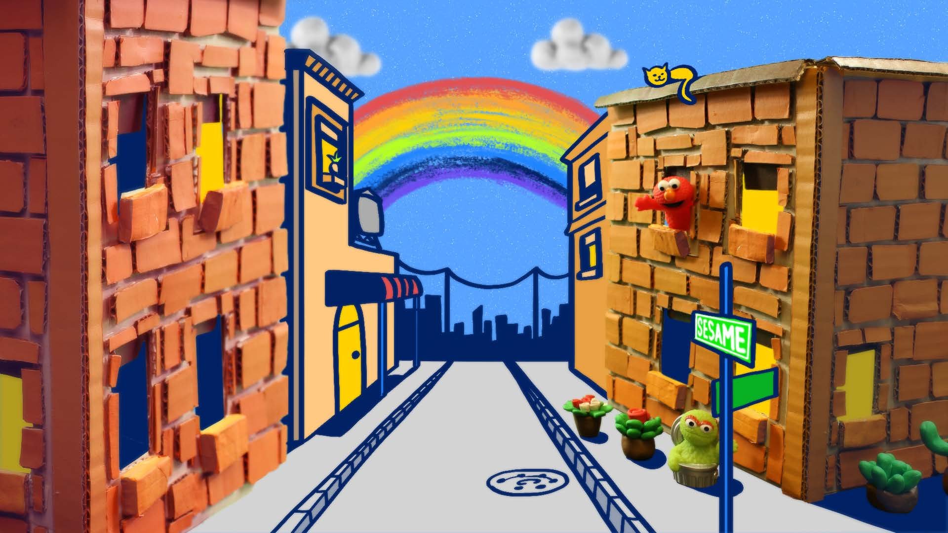
Style Frame 16x9


Style Frame 1x1


Animation
The animation is too long and boring..The movement is slow and floaty. It does not show the energy of the piece…
Revision Pass
What I’ve learned in this pass is always checking the animation to make sure it has enough energy and excitement. Also, it is very important to ask around and get critique from others to see if our story makes sense and the messages get through.
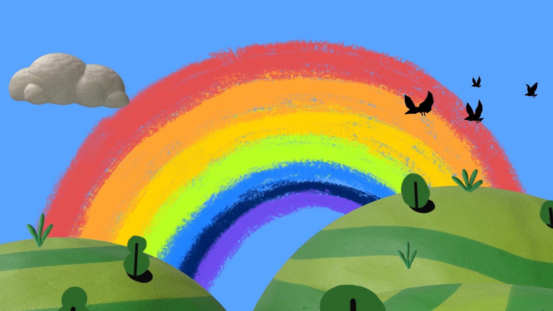
Style Frame 16x9


Animation
Overall, the animation is still floating and does not make sense with the story. After this pass, I did a lot of research about character animation and cut the length shorter
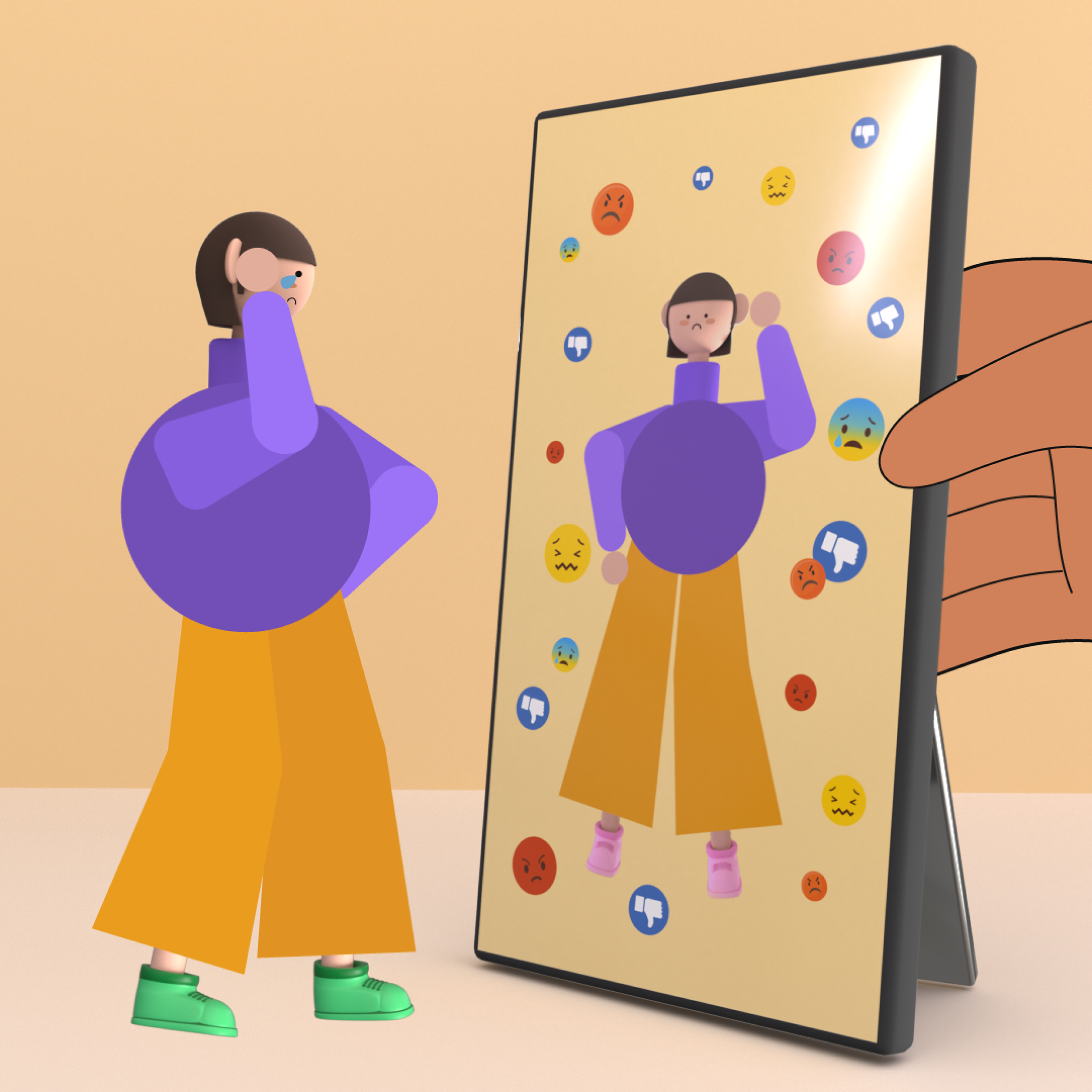
Notes
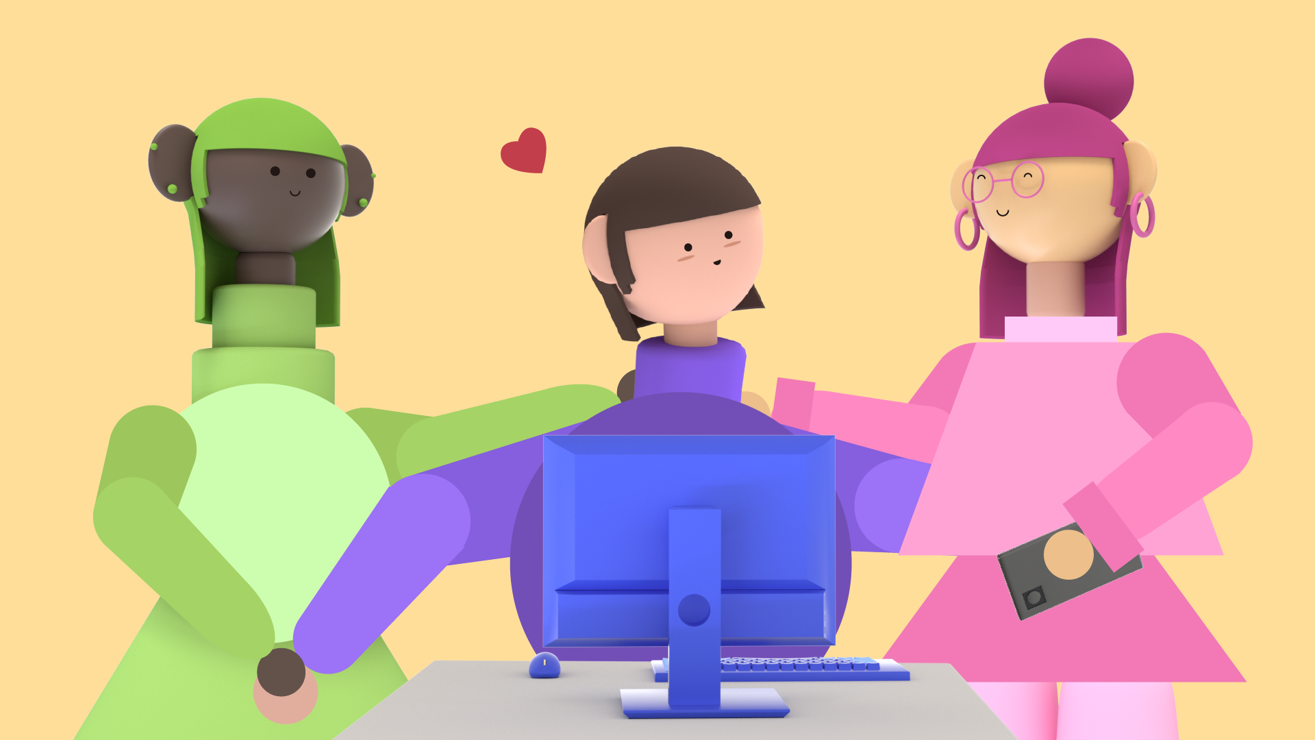
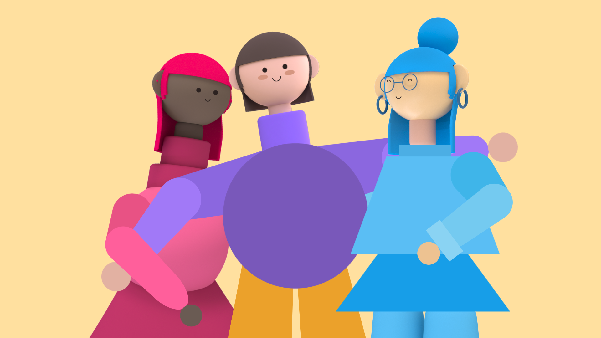
The feedback that I got was the piece focused too much on the purple girl. It should be about all of them since the article focused on “teens”. Also, the animation needs to be much faster, more energetic and exciting.
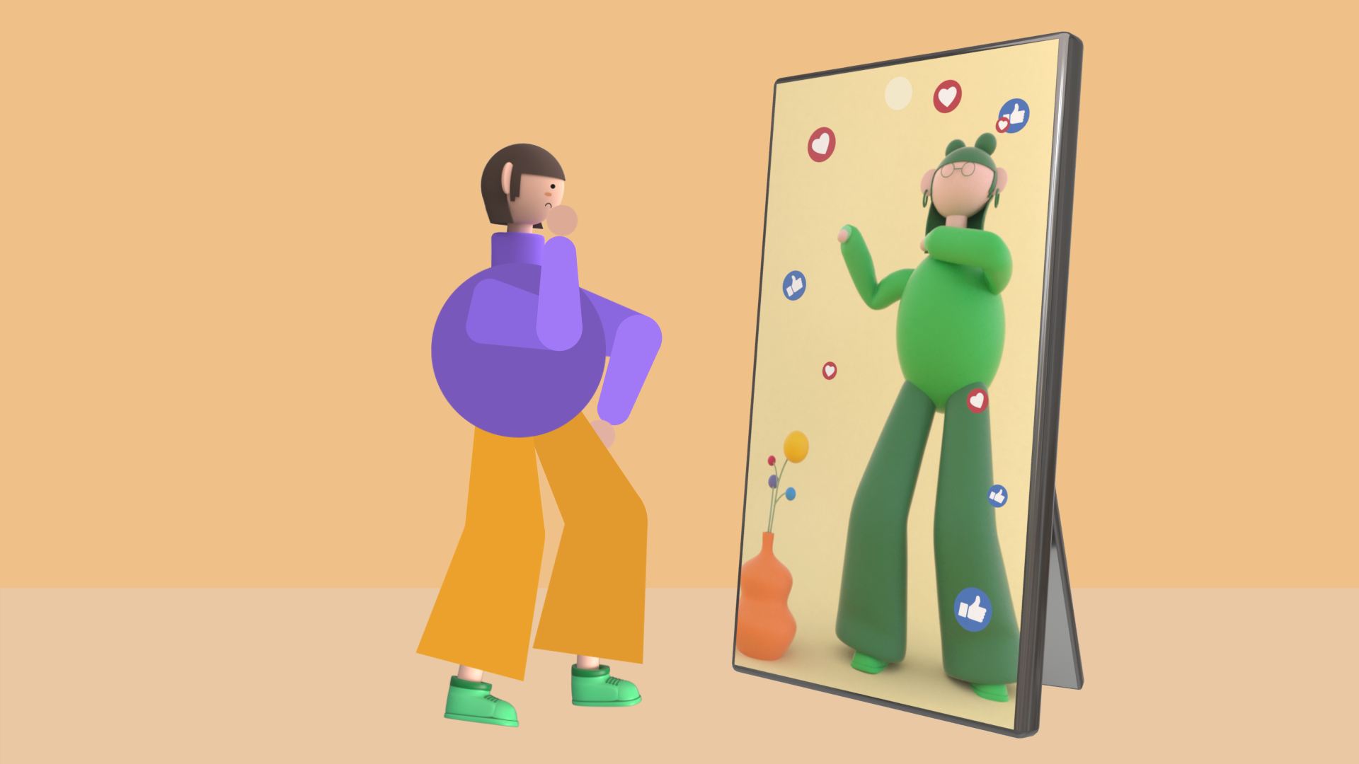
Final Pass
I’ve learned that constantly asking for feedback is very important because as a designer and animator, things that we think it is easy to understand but to the audience, sometimes it is not clear enough.
Style Frame 16x9


Style Frame 1x1


Animation

Square Format
